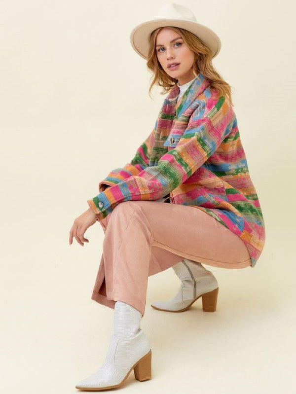
Color coordination is the invisible thread that transforms random clothing pieces into sophisticated, intentional outfits that feel harmonious and polished. Understanding how to work with seasonal color palettes while maintaining your personal style creates a wardrobe that feels fresh and appropriate throughout the year while ensuring all your pieces work together seamlessly. This skill becomes particularly valuable for college students building versatile wardrobes that need to serve multiple occasions and seasons without constant replacement.
Understanding Color Theory Fundamentals
The Color Wheel Foundation provides the structure for all successful color coordination. Primary colors (red, blue, yellow) combine to create secondary colors (green, orange, purple), which further blend into tertiary colors. Understanding these relationships helps you predict which colors will work harmoniously together and which will create dynamic contrast.
Warm vs. Cool Undertones significantly impact how colors work together and how they appear on different people. The Citrus Splash Maxi Dress likely features warm undertones that complement other warm colors like coral, golden yellow, or warm browns, while cool-toned pieces work better with blues, purples, and cooler greens.
Saturation and Intensity affect how colors interact within outfits. Highly saturated colors demand attention and work best as focal points, while muted tones provide sophisticated backgrounds that allow other elements to shine.
Value Relationships between light and dark colors create contrast and visual interest. Understanding how to balance light and dark elements ensures your outfits have appropriate visual weight and don't appear flat or overwhelming.
Spring Color Palettes: Fresh Beginnings
Soft Pastels dominate spring color stories, offering gentle, optimistic hues that reflect the season's renewal energy. These colors work beautifully for creating romantic, feminine looks that feel fresh and youthful.
Clear Brights provide energy and optimism perfect for spring occasions. The Floral Tiered Maxi Dress W/Drawstring Waist might incorporate these clear, energizing colors that capture spring's vitality while maintaining sophisticated appeal.
Green Variations from soft sage to vibrant emerald reflect spring's natural growth and pair beautifully with other spring colors. Green serves as an excellent neutral that works with both warm and cool color families.
Coordination Strategies for spring often involve combining pastels with whites or creams for sophisticated, cohesive looks that feel seasonally appropriate while maintaining versatility.
Summer Color Mastery: Vibrant Confidence
Bold Primaries work beautifully in summer's bright light, creating confident, energetic looks that complement the season's active lifestyle. These colors photograph well and create memorable, impactful outfits.
Tropical Inspirations bring coral, turquoise, and sunny yellow into summer wardrobes, creating vacation-inspired looks that feel joyful and appropriate for warm weather activities.
Nautical Classics like navy and white combinations provide sophisticated summer options that work for both casual and more formal warm-weather occasions.
Heat-Appropriate Choices consider how colors absorb or reflect heat, with lighter colors generally providing more comfort in very warm conditions while darker colors might be reserved for air-conditioned environments.
Fall Color Sophistication: Rich Depth
Jewel Tones emerge in fall palettes, offering rich, sophisticated colors like emerald, sapphire, and ruby that feel luxurious and appropriate for the season's more formal social calendar.
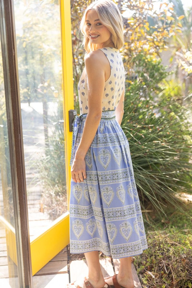
Earth Tones provide grounding, natural colors that reflect fall's changing landscape. The Border Print Midi Dress W/Self Belt might feature these sophisticated earth tones that feel seasonally appropriate while maintaining elegant appeal.
Warm Neutrals like camel, cognac, and warm gray create sophisticated bases for fall outfits while working beautifully with both jewel tones and earth colors.
Layering Color Strategies become important in fall when multiple pieces need to work together harmoniously. Understanding how colors interact in layered looks ensures cohesive, sophisticated appearances.
Winter Color Elegance: Sophisticated Depth
Deep Jewel Tones reach their full impact in winter, providing rich, luxurious colors that feel appropriate for the season's formal occasions and holiday celebrations.
Classic Neutrals like black, navy, and charcoal provide sophisticated foundations for winter wardrobes while working beautifully with metallic accents and rich color additions.
Metallic Accents become particularly appropriate in winter, adding glamour and light to darker color palettes while providing sophisticated detail that enhances rather than overwhelms outfits.
Monochromatic Sophistication works beautifully in winter when different shades of the same color create elegant, cohesive looks that feel polished and intentional.
Building a Cohesive Color Palette
Personal Color Analysis helps identify which colors make you look healthiest and most vibrant. These colors should form the foundation of your wardrobe, with seasonal variations providing variety while maintaining your most flattering hues.
Signature Color Development involves identifying 3-4 colors that consistently make you feel confident and look great, then building seasonal variations around these core colors.
Neutral Foundation Strategy uses versatile neutral pieces as wardrobe foundations that work with multiple color additions, creating maximum versatility from fewer pieces.
Accent Color Rotation allows you to incorporate seasonal trends and colors through smaller pieces like accessories, tops, or accent details without requiring complete wardrobe overhauls.
Coordinating Patterns with Solid Colors
Pattern Proportion Balance ensures patterns don't overwhelm outfits while providing visual interest. The Mixed Print Tie Waist Midi Dress demonstrates how patterns can work harmoniously when they share color families or proportional relationships.
Color Extraction Technique involves pulling solid colors from patterned pieces to create cohesive outfits. If a floral print contains blue, pink, and green, incorporating solid pieces in these colors creates intentional, coordinated looks.
Pattern Mixing Strategies require understanding how different patterns interact and ensuring they share color elements or proportional relationships that create harmony rather than chaos.
Background Color Emphasis uses the dominant background color in patterned pieces as a guide for coordinating solid pieces, creating sophisticated color relationships that feel intentional.
Seasonal Transition Strategies
Bridging Color Techniques help pieces work across seasonal boundaries through strategic styling and color combination. Pieces that work in multiple seasons provide excellent wardrobe value.
Layering Color Coordination becomes crucial during transitional seasons when multiple pieces need to work together harmoniously across varying temperatures and occasions.
Accessory Color Bridges allow you to connect seasonal colors through smaller pieces that can be easily changed or layered, creating cohesive looks without major wardrobe investments.
Gradual Palette Shifts reflect natural seasonal changes through subtle color adjustments rather than dramatic wardrobe overhauls, creating authentic seasonal appropriateness.
Professional Color Coordination
Workplace Color Psychology considers how different colors are perceived in professional settings, ensuring your color choices support your professional goals while maintaining personal style.
Authority Color Choices like navy, burgundy, and forest green convey competence and reliability while providing sophisticated alternatives to basic black for professional settings.
Seasonal Professional Adaptation allows your professional wardrobe to reflect seasonal changes appropriately while maintaining consistent professional standards and personal branding.
Industry Considerations recognize that different professional environments have varying color expectations, from conservative financial settings to creative industries that welcome more color experimentation.
Color Coordination for Different Occasions
Casual Color Freedom allows for more experimental color combinations and personal expression while maintaining harmonious, intentional appearances.
Formal Color Sophistication typically requires more restrained color palettes that emphasize elegance and appropriate formality while still allowing for personal style expression.
Social Event Color Strategy considers the event's context, season, and formality level while ensuring your color choices feel appropriate and confident.
Academic Color Appropriateness balances personal expression with professional preparation, creating color choices that feel authentic while supporting academic and career goals.
Creating Color Stories
Outfit Color Narratives involve choosing colors that work together to tell a cohesive visual story, whether that's fresh spring optimism or sophisticated fall elegance.
Emotional Color Connections recognize that colors affect mood and energy levels, allowing you to choose color combinations that support your emotional and psychological needs.
Personal Color Signature develops over time as you identify color combinations that consistently make you feel confident and receive positive responses from others.
Seasonal Color Evolution allows your color preferences to develop and change naturally while maintaining core color relationships that define your personal style.
Practical Color Coordination Tips
Lighting Considerations affect how colors appear in different environments, from natural daylight to indoor lighting. Understanding these variations helps you choose colors that work in your daily environments.
Photography Impact considers how colors appear in photos, particularly important for social media and professional photography where color coordination becomes especially visible.
Wardrobe Planning involves building color coordination into your wardrobe development strategy, ensuring new pieces work with existing items while expanding your color options.
Maintenance Strategies for colored clothing help maintain vibrancy and appearance over time, ensuring your color coordination efforts continue to look fresh and intentional.
Common Color Coordination Mistakes
Overmatching creates looks that feel too coordinated and lack visual interest. Successful color coordination includes subtle variations and contrasts that create sophistication.
Ignoring Undertones leads to colors that technically match but don't feel harmonious because their underlying warm or cool qualities conflict.
Seasonal Inappropriate Choices can make outfits feel disconnected from their environmental context, reducing their overall impact and appropriateness.
Personal Style Abandonment occurs when color coordination rules override personal preferences, resulting in outfits that feel technically correct but authentically unsatisfying.
Building Long-Term Color Confidence
Experimentation Approach encourages trying new color combinations while building on successful ones, gradually expanding your color coordination skills and confidence.
Investment Strategy focuses on building a color-coordinated wardrobe through thoughtful purchases that work with existing pieces while adding new color possibilities.
Seasonal Wardrobe Planning involves preparing for seasonal color transitions through strategic shopping and styling approaches that maximize existing pieces while incorporating seasonal freshness.
Personal Style Evolution recognizes that color preferences may change over time while maintaining core color relationships that define your authentic style.
Mastering seasonal color coordination creates a wardrobe that feels intentional, sophisticated, and personally authentic throughout the year. Whether you're working with the fresh optimism of spring pastels or the rich sophistication of winter jewel tones, understanding how colors work together ensures your outfits always feel harmonious and polished.
The key is finding the balance between seasonal appropriateness and personal preference, creating color stories that feel authentic to your style while respecting the natural rhythm of seasonal change. With practice and attention to color relationships, you'll develop the confidence to create beautiful, cohesive outfits that serve your lifestyle while expressing your unique aesthetic vision.


